You want a home that feels modern, comfortable, and distinctly Canadian — and the right paint makes that happen. Warm neutrals, earthy tones, and a few deep, moody accents lead 2025’s palette, giving you options that read timeless in living rooms, calming in bedrooms, and bold where you want drama.
This guide shows which colours perform well by room and region, how to blend trending hues with classic design styles, and which eco-friendly finishes keep your space healthy and stylish. Expect practical tips for testing swatches, pairing accents, and creating a cohesive home palette that reflects both current trends and lasting taste.
Top Paint Colour Trends for Canadian Homes in 2025
Expect earthy, moody, and jewel-inspired hues that balance comfort with modernity. You’ll see warm neutrals for living spaces, deeper greens and blues for feature walls, and saturated accents used sparingly to add personality.
Emerging Colour Palettes
Designers favor palettes that pair warm, grounded tones with a single rich accent. Think muted terracotta, soft ochre, and mushroom gray combined with deep forest green or indigo for contrast. These combinations work well across open-plan homes and smaller condos because they create visual depth without overwhelming the space.
Use a dominant neutral on large surfaces and introduce the richer tone on a focal wall, built-ins, or cabinetry. For trim and ceilings, choose a slightly lighter or cooler variant of your base to keep transitions subtle. Consider matte or low-sheen finishes to reinforce the cozy, tactile quality of these palettes.
Popular Neutrals and Earth Tones
You’ll notice warm beiges, greige, and clay-inspired hues leading the neutral category. These tones read as versatile backdrops that layer well with wood and natural fibers. They suit living rooms, hallways, and bedrooms where you want a calm, lived-in feel.
For kitchens and bathrooms, opt for slightly cooler greige or taupe to resist warm lighting shifts. If you want longevity, select neutrals with balanced undertones—neither too pink nor too green—so furnishings and art remain compatible over time. Use sample swatches on multiple walls to test undertone interactions before committing.
Vibrant Accent Colours
Accent colours in 2025 lean toward saturated jewel tones: teal, deep sapphire, and oxblood appear frequently. Use these for entryways, powder rooms, furniture pieces, or a single built-in to create impact without repainting large areas.
Apply accents in a 70/20/10 approach: 70% neutral field, 20% secondary tone (like a muted green), and 10% vibrant accent. This ratio helps maintain balance while letting the accent read as intentional. For finishes, eggshell or satin highlights keep vibrant tones lively and resilient in high-traffic zones.
Choosing the Right Paint Colours by Room
Focus on how light, function, and existing finishes affect colour choices. Prioritize undertones that coordinate with floors, countertops, and large furniture to avoid clashing after paint goes up.
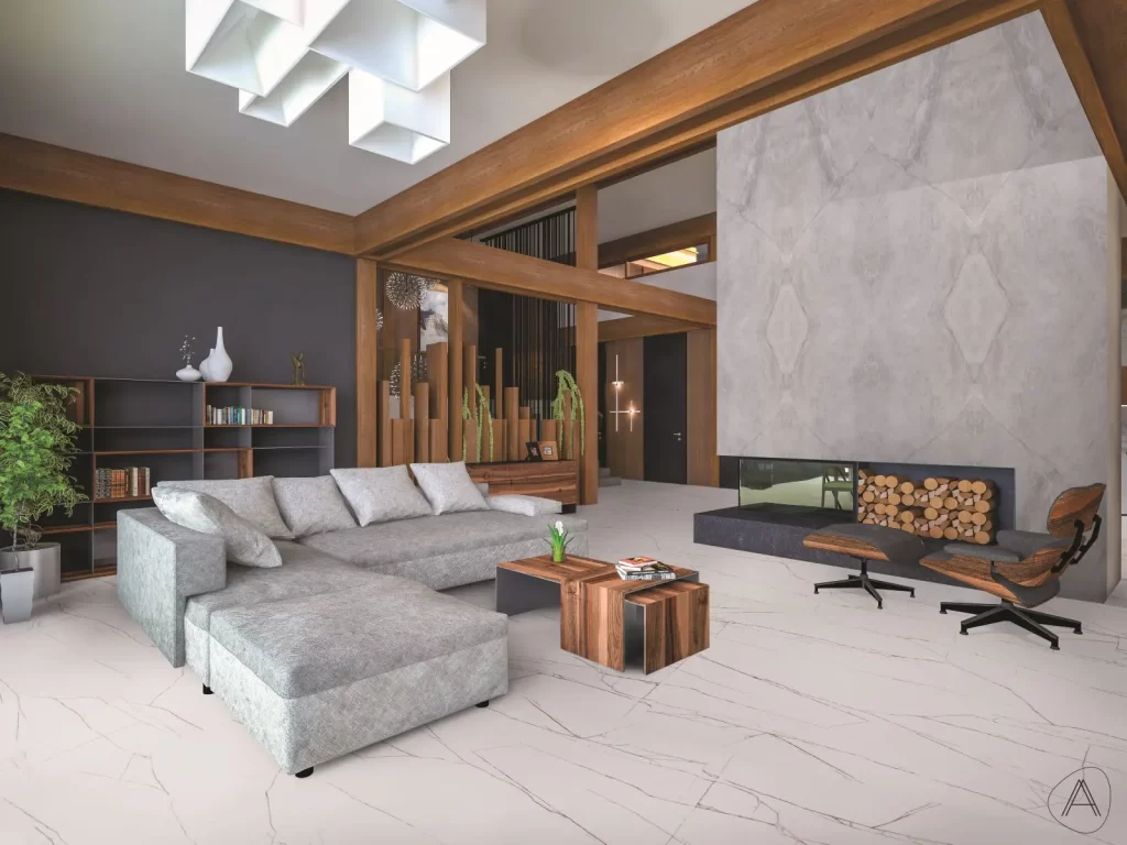
Living Room Inspirations
Pick a primary wall colour that complements your flooring and large furniture pieces. For south- or west-facing living rooms, choose cooler neutrals like soft greige or muted sage to balance warm sunlight. In north-facing rooms, lean into warm creams or buttery taupes to add perceived warmth without feeling yellow.
Use one accent wall or trim in a deeper hue—charcoal, deep olive, or warm navy—to create depth without overwhelming the room. If you have an open-plan space, repeat a unifying neutral on trim or cabinetry to tie adjacent zones together. Test swatches at different times of day and view them next to your rug and sofa before committing.
Bedroom Colour Ideas
Aim for restful hues that match your bedtime routine and bedding palette. Soft blues, dusty lavender, and warm greys promote calm; choose a shade with subtle undertones that match your linens and window treatments. For smaller bedrooms, use lighter, warm neutrals to make the space feel larger and more breathable.
Reserve richer tones—deep mauve, forest green, or slate—for a focal wall behind the bed if you want drama. Keep ceilings and trim two to three shades lighter than walls to maintain an airy feel. Consider low-VOC paints and satin or eggshell finishes for bedrooms to improve indoor air quality and soft reflectance.
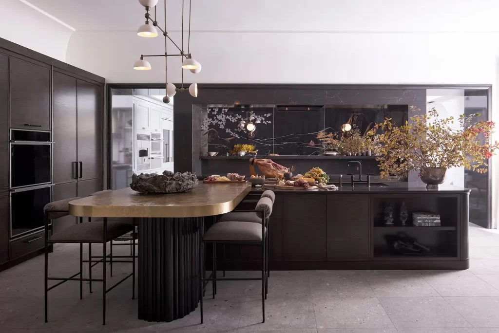
Kitchen and Dining Area Choices
Prioritize colours that coordinate with countertops, backsplash, and cabinetry hardware. Bright whites and soft greiges remain popular for cabinets; pair them with warm wood or cool stone surfaces depending on your kitchen’s undertone. For dining zones open to the kitchen, choose a unified palette—muted terracotta or olive can work well with natural wood tables.
Use washable, semi-gloss finishes on trim and cabinetry for durability. Reserve bolder choices—deep teal or charcoal—for islands, lower cabinets, or built-in shelving to create contrast while keeping upper cabinets light for an open feel. Test paint against your countertop and flooring samples under both natural and artificial light.
Regional Influences on Paint Colour Preferences
Coordinating colour with local light, landscape, and building materials gives you a stronger design outcome. Pay attention to natural tones, seasonal light shifts, and common exterior finishes when choosing paint.
Coastal and Maritime Aesthetics
Along the Atlantic and Pacific coasts, you’ll see colours that respond to salt air, fog, and bright seaside light. Opt for muted blues, desaturated greens, and warm greys that echo the ocean and nearby dunes while hiding salt staining on trim.
Use high-quality, mildew-resistant exterior paint and satin or semi-gloss finishes on trim to resist moisture and make cleaning easier.
Inside, choose cool neutrals with warm accents to balance often grey daylight. Think soft sea-glass greens for bathrooms, pale sky blues for living rooms, and driftwood greys for kitchens.
You can introduce contrast with crisp white or deep navy on doors and window frames to frame views and handle coastal wear.
Prairie and Rural Home Themes
In prairie regions, light is broad and direct; choose colours that complement wide horizons and seasonal changes. Earthy tones—warm beiges, soft ochres, and cinnamon-inspired browns—work well on exteriors and blend with grain fields and native grasses.
Matte or low-sheen finishes on siding reduce glare, while satin on trim adds subtle definition.
For interiors, embrace layered neutrals with tactile finishes: linen whites, clay-based terracotta accents, and deep forest greens for focal walls or cabinetry.
Pick paint formulas with good UV resistance for south-facing facades and consider darker baseboards or trim to hide scuffs from high-traffic rural living.
Incorporating Design Styles with 2026 Colour Trends
Select colours that support the function and scale of each room, and match finishes to your furniture and lighting. Focus on contrast for modern spaces and layered warmth for traditional homes.
Modern and Minimalist Styles
Choose muted, earthy neutrals like warm greige or soft clay as base walls to keep the space calm and adaptable. Use deep, moody accents—for example, a charcoal or deep forest green—on a single feature wall or built-in shelving to add depth without clutter.
Pick low-sheen finishes (matte or eggshell) to maintain a flat, refined look. Keep trim and ceilings in crisp, slightly warm white to create subtle contrast with the walls. Use paint to define zones in open-plan layouts: paint the kitchen alcove a tone darker than the living area to visually separate functions.
Limit your palette to two main tones plus one accent. This makes furniture and textiles stand out and keeps visual noise low. For cabinetry and metalwork, consider coordinating with the accent colour rather than matching it exactly.
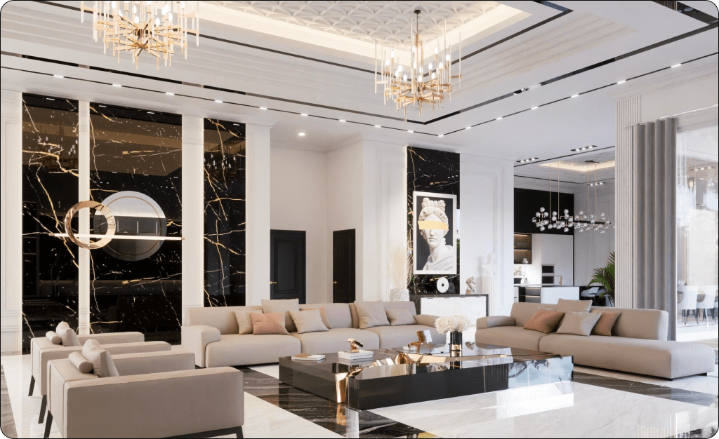
Traditional Canadian Interiors
Lean into earthy neutrals and warm taupes to complement wood floors, crown moulding, and heritage millwork. Use layered tones: a mid-tone wall colour, a lighter trim, and a richer accent on doors or a fireplace surround to enhance architectural details.
Introduce jewel tones—deep teal, oxblood, or sapphire—in upholstery or a single wall to create focal points that feel timeless. Choose satin or semi-gloss on trim and built-ins to highlight profiles and reflect light in older homes.
Balance colour with pattern: pair painted walls with patterned rugs or drapery in complementary hues rather than competing shades. For heritage-style kitchens, paint lower cabinets in a grounded, darker tone and upper cabinets or pantry in a lighter neutral to keep the room feeling open.
Sustainable and Eco-Friendly Paint Options
You’ll find practical choices that cut indoor pollutants, reduce environmental impact, and still deliver durable, on-trend colours. Focus on low-VOC formulations, natural binders, and reputable Canadian brands that disclose ingredients and certifications.
Low-VOC and Natural Paints
Choose paints labeled low-VOC (volatile organic compounds) or zero/very low VOC to lower off-gassing during and after application. These formulations typically contain <50 g/L VOC for interior paints, improving indoor air quality—important in tightly sealed Canadian homes during long winters.
Look for natural alternatives like mineral paints (lime, clay, or silicate) and plant-oil based alkyds when you need higher durability. They often avoid synthetic solvents and petrochemical resins but require different application techniques and may have specific substrate needs.
Check product Technical Data Sheets for VOC numbers and application guidelines. Also verify third-party certifications such as Green Seal, EcoLogo (UL ECOLOGO), or GREENGUARD to confirm low emissions and verified ingredient claims.
Canadian Eco Brand Recommendations
Prioritize brands that publish full ingredient lists and performance data for Canadian climates. Notable Canadian-friendly options include:
- Benjamin Moore Natura / Aura (low/zero VOC lines, wide colour range, strong stain resistance)
- CIL Eco-Choice (budget-friendly low-VOC alternatives with Canadian distribution)
- ECOS Paints (zero-VOC, waterborne, free of common toxins, suitable for homes with chemical sensitivities)
Compare products on these criteria: VOC value (g/L), scrub and stain resistance ratings, freeze-thaw handling for colder storage, and warranty for interior use. Ask retailers about sample pots and test patches under your home’s lighting to confirm colour and performance before committing to larger cans.
Tips for Selecting and Testing Paint Colours
Focus on how natural and artificial light change perceived colour, and on practical sample methods that reveal true tones on your walls. Prioritize testing large swatches in different lighting and observe at multiple times of day.
Lighting Considerations
Evaluate light direction first: north-facing rooms get cool, indirect light that mutes warm tones, while south-facing rooms get stronger, warmer light that brightens and can wash out pale colours. East-facing rooms show cool mornings and warm afternoons; west-facing rooms warm up late in the day.
Pay attention to the type and colour temperature of your fixtures. LED bulbs come in warm (2700–3000K), neutral (3500–4000K), and cool (5000K+) — match test swatches to the bulbs you use.
Watch how neighbouring surfaces affect perception. Hardwood floors, large rugs, and cabinetry reflect colour back onto walls; test near those surfaces.
Check swatches at morning, midday, and evening. Take photos under each light condition to compare, but rely on in-person viewing for final judgement.
Sample Application Techniques
Buy sample pots and paint at least two 24-inch square areas on different walls rather than using small peel-and-stick cards. Larger swatches reveal undertones and how colour reads from a distance.
Use primer under darker samples to match the final surface, or apply samples over the actual wall finish if you won’t prime. Paint vertically and horizontally to simulate brush or roller texture; let samples fully cure (24–48 hours) before judging.
Label each sample with brand, code, and finish (eg, eggshell, satin). Live with them for several days and view at different times while doing typical activities — reading, cooking, or watching TV — to see how the colour performs in real use.
Expert Advice for a Cohesive Home Palette
Start by choosing a base neutral that you and your household find calming. Use that neutral on 60–70% of visible surfaces—walls, trim, and major furniture—to create a visual anchor throughout your home.
Pick two supporting colors to play secondary roles in 20–30% of your space. One should be a warm or cool neutral; the other can be a richer accent for occasional walls, textiles, or statement pieces.
Test paint in situ at different times of day. Natural and artificial light change undertones, so paint large swatches on multiple walls and observe for at least 48 hours before committing.
Create a simple rule for transitions between rooms. For example: keep undertones consistent, move from light to dark, or repeat one accent color every three rooms. Simple rules reduce visual friction and make flow feel intentional.
Use finishes to add depth without changing color. Matte or eggshell on walls, satin on trim, and semi-gloss in high-moisture areas will help your palette read as layered and professional.
Keep a small, portable kit of swatches, fabric samples, and a photo of your main room. Bring these when shopping for paint, tile, or upholstery so you match undertones rather than approximate them.
Consider scale and function when placing accents. Use bolder colors on large, less-detailed surfaces and reserve high-contrast accents for smaller items like cushions, doors, or built-ins.
Plan Your Painting Project with Lifetime Building Services
If you are ready to refresh your home with modern paint colors and professional finishes, Lifetime Building Services is here to help. Our experienced team delivers high quality interior and exterior painting solutions designed to enhance comfort, style, and long term value. From colour selection to flawless application, we handle every detail with care and precision.
Visit https://lifetimebuildings.ca/contact/ to schedule your consultation and bring your space to life with confidence.