You can make any room feel larger and brighter by choosing the right light paint colors and finishes. Bold, dark hues shrink a space soft whites, warm creams, pale grays, and airy pastels reflect more light and create visual depth, so walls, ceilings, and trim read as a single, continuous plane. Pick light, reflective shades and a matching finish to bounce natural and artificial light around the room and instantly open up your space.
This post walks through why light colors expand a room, the best shades for different vibes, how finish affects brightness, and practical room-by-room recommendations you can use today. You’ll also get pairing tips and common pitfalls to avoid so your refreshed walls stay crisp and inviting.
Why Light Paint Colors Enhance Space
Light paint colors increase reflected light, soften shadows, and reduce visual boundaries, so rooms read as larger and more open. They influence how your eye tracks surfaces, how warm or cool the space feels, and how architectural details appear.
The Science of Light Reflection
Light hues have higher Light Reflectance Values (LRV), so they bounce more natural and artificial light around a room. When you choose a paint with an LRV above 60, surfaces return a larger percentage of light, which brightens corners and minimizes deep shadows.
Matte versus satin finishes matters too. Satin and eggshell reflect a little more light than flat, helping surfaces appear smoother without obvious shine. Keep trim and ceilings slightly lighter than walls to maximize upward light bounce and create a feeling of height.
Window placement also interacts with paint choice. South- and west-facing rooms benefit from cooler light-reflective tones to tame warm sunlight, while north-facing spaces often need warmer light neutrals to prevent a cold appearance.
Color Psychology and Perception
You perceive space partly through color temperature and contrast. Cool light blues and pale grays visually recede, making walls seem farther away, while warm creams and soft beiges can read as inviting yet still expansive.
Lower contrast between walls, trim, and ceiling reduces interrupted visual lines. If your trim and ceiling are only a shade or two lighter than the walls, your eye travels uninterrupted, enlarging perceived volume. Strong contrasting moldings or dark accent walls will do the opposite.
Think about the mood you want: choose cool tones for a crisp, airy feel, or warm tones to keep a space bright and cozy. Either approach can expand your room, so match color temperature to lighting conditions and how you use the room.
Visual Tricks for Expanding Rooms
Use continuous color across connected spaces to create flow. Painting hallways and adjacent rooms the same light neutral extends sightlines and reduces visual breaks that make spaces feel fragmented.
Apply vertical or horizontal elements strategically. Painting the ceiling a light tint of the wall color draws the eye upward, increasing perceived height. Horizontal stripes or a lighter color on the far wall can make a narrow room feel wider.
Keep trim and doors in similar light tones to walls to minimize hard edges. Reserve darker or saturated colors for small accents; they provide depth without shrinking the whole room.
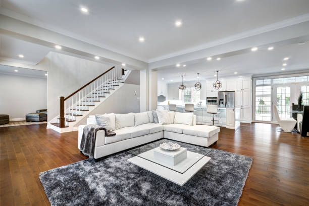
Top Light Paint Shades for Open, Bright Interiors
Choose tones that reflect light, reduce visual clutter, and coordinate with your fixtures and flooring. Focus on undertones, finish, and how each shade interacts with natural and artificial light in your specific room.
Classic Whites
Classic whites maximize light reflection and create a clean backdrop for furniture and art. Pick a white with a slight undertone that complements your trim and flooring: warm whites (cream or ivory) pair well with honeyed woods, while cool whites (blue or gray hints) work with chrome, glass, and cool-toned tile.
Use an eggshell or satin finish on walls to balance reflectivity and conceal minor surface flaws. Test whites on three different walls at different times of day; a single white can read very warm at noon and stark under evening light.
If you want layered depth, paint trim and ceilings in a brighter white and walls in a softer white to maintain contrast without breaking the open feel. Note how shadows form around window frames and furniture—choose a white that keeps those shadows soft rather than harsh.
Soft Neutrals
Soft neutrals like warm beiges, pale greiges, and light taupes add warmth without closing a room off. These shades reduce glare while still bouncing light, making them ideal for living rooms, bedrooms, and open-plan spaces where you want a cozy but airy feel.
Match the neutral’s undertone to your dominant materials: yellow-beige works with brass and warm wood; greige suits stone and concrete; taupe complements leather and rattan. Use a satin finish to maintain a slight luster that reads as fresh but not shiny.
Consider accenting one wall with a slightly deeper neutral to anchor seating areas. Keep textiles and rugs a few shades darker or lighter than the walls to maintain contrast and prevent the space from feeling flat.
Subtle Pastels
Subtle pastels muted sage, dusty blue, pale blush introduce gentle color while preserving brightness. These shades add personality without overpowering the room, and their low saturation helps them reflect light like neutrals.
Choose pastels with gray undertones for a sophisticated, subdued look; warmer pastels (soft peach or warm blush) warm north-facing rooms. Pair pastels with crisp white trim and natural textures like linen and unfinished wood to keep the palette grounded.
Apply pastel colors in rooms where you want a calm mood bedrooms, nurseries, and small sitting areas. Test samples under your room’s lighting; even muted pastels can read stronger at scale.
Modern Grays
Modern grays range from barely-there cool tones to warm, greige-leaning options that read almost neutral. Light gray walls create a contemporary, spacious feel and work especially well with matte or low-sheen finishes for subtle sophistication.
Select a gray based on light direction: south facing rooms handle cooler grays well, while north-facing rooms benefit from grays with warm undertones to avoid a cold appearance. Coordinate gray walls with warm metal accents or wood to prevent a sterile look.
Use a slightly lighter ceiling color to visually raise the room. For open-plan spaces, maintain consistent gray tones across connected areas, then vary texture and finish plaster, wood grain, textiles to create visual interest without fragmenting the space.
Choosing the Right Finish for Increased Brightness
Pick finishes that balance light reflection with surface imperfections and durability. Lighter sheens increase perceived brightness but also show flaws and clean differently; choose by room function and wall condition.
Matte vs. Satin
Matte (flat) absorbs more light, reducing glare and hiding small bumps or brush marks. Use matte on textured or older walls where you want a smooth, even appearance without highlighting flaws. It won’t bounce much light, so pair matte walls with crisp white trim or a higher-sheen ceiling to prevent the room from feeling dull.
Satin reflects more light than matte and still softens imperfections. It gives a subtle sheen that helps walls read brighter, especially under natural light. Satin cleans better than matte, making it a good choice for living rooms, bedrooms, and hallways where you want a balance of brightness and low maintenance.
Using Semi Gloss Effectively
Semi gloss reflects significant light and can make small rooms feel brighter by increasing overall luminance. Use semi-gloss on trim, doors, and ceilings where you want distinct highlights and easy cleaning, but avoid full-room application on imperfect drywall because it emphasizes flaws.
If you prefer some wall sheen without the mirror effect, apply semi gloss as an accent on one focal wall, built-ins, or lower wall panels while keeping the main walls in satin or matte. For high moisture spaces like kitchens and bathrooms, semi gloss resists stains and moisture; choose it there for practical brightness and longevity.
Room by Room Light Paint Color Recommendations
Choose paint colors that boost natural light, balance artificial lighting, and match your room’s purpose and furnishings. Prioritize high LRV neutrals for small or north-facing rooms, and add subtle warm or cool undertones to complement your flooring and fixed finishes.
Living Rooms
Pick a light neutral with an LRV above 65 to keep the space feeling open and reflective. Soft warm whites (creamy whites with subtle yellow undertones) work well if you have warm-toned wood floors or brass hardware.
If your living room gets cool, indirect light, choose a pale warm gray or greige to avoid a sterile feel while still maximizing brightness.
Use one of these simple schemes:
- Walls: light warm white or greige
- Trim: brighter white (higher LRV) for contrast
- Accent: muted pastel or soft sage on one wall if you want depth
Test swatches on multiple walls and observe them at morning and evening light. That prevents surprises from lamps or sunset tones.
Bedrooms
Aim for calming, light tones with a slightly lower LRV than living rooms to promote rest. Pale dove gray, soft blush beige, or muted sage provide brightness without feeling clinical.
Match the undertone to your bedding and window direction: choose warmer undertones for north facing rooms and cooler undertones for sunlit, south facing rooms.
Consider painting the ceiling a shade lighter than the walls to increase perceived height. Use matte or low-sheen finishes on walls to minimize glare and satin on trim for easy cleaning.
Kitchens
Select washable, light-reflective colors because kitchens benefit from both brightness and practicality. Bright whites with a touch of warmth or a very pale buttery yellow amplify task lighting and keep cabinets looking fresh.
If cabinets are dark, choose a high LRV wall color to counterbalance them; if cabinets are light, a soft cool blue-gray can add subtle contrast without shrinking the space.
Practical palette checklist:
- Walls: high-LRV warm white or pale yellow
- Cabinets: coordinate contrast (dark cabinets → lighter walls)
- Backsplash/accents: slightly deeper tone or patterned tile for visual interest
Always sample near countertops and under your kitchen’s actual light fixtures before committing.
Pairing Light Paint Colors With Decor
Choose materials and tones that reflect light and create continuous sightlines. Aim for floors, rugs, and furniture that support your paint’s undertone and keep contrast gentle to preserve an airy feel.
Best Flooring and Rugs
Select flooring with light to medium LRV (Light Reflectance Value) to boost brightness without showing every speck of dirt. Pale oak, bleached maple, and light porcelain tile work well, they reflect light and read as warm or neutral depending on their undertone.
Use rugs to add texture and define zones while maintaining scale. Go for low to medium pile rugs in creams, soft grays, or faded pastels to keep visual weight low. Patterned rugs can work if the pattern uses two or three muted tones and repeats the wall color subtly.
Place rugs so they anchor furniture front legs on the rug for sofas and chairs to create continuity and avoid fragmenting the floor plane. Choose rug sizes that leave a consistent border of floor around the perimeter to lengthen sightlines.
Complementary Furniture Tones
Match furniture tones to your paint’s undertone to avoid color clashes. For cool light paints (blue-grays, cool whites), pick furniture in walnut with cool stains, ash, or cool toned upholstery like slate, dove gray, or navy accents. For warm light paints (creams, warm beiges), choose honey oak, teak, or upholstery in warm taupe, terracotta, or mustard.
Keep contrast moderate: medium contrast relationships make elements readable without shrinking the space. Use accent pieces pillows, throws, a single dark lamp to provide focal points rather than heavy blocks of color.
Favor furniture with exposed legs, open bases, or glass tops to preserve sightlines and airiness. Matte or satin finishes reduce glare while subtle metallic accents (brushed brass or satin nickel) add polish without overpowering the room.
Common Mistakes to Avoid With Light Paint Colors
Pick colors that work with your room’s fixed elements and the light that actually hits the walls. Small missteps with undertones or light can make a pale color read muddy, flat, or too cool for your furnishings.
Ignoring Undertones
Undertones change how a “white” or “light” shade reads against your floors, countertops, and textiles. Warm undertones (yellow, peach, or pink) will pull a soft beige or off white toward cream; cool undertones (blue, green, or gray) will make the same paint feel crisp or slightly clinical. Test swatches on walls near baseboards and next to flooring samples to see interactions.
View swatches at different times of day. Paint chips under store lighting rarely match how a wall looks at 8 a.m., noon, or after sunset. If you have brass fixtures, warm woods, or warm-toned leather, favor paints with subtle warm undertones; if you have stainless steel, cool stone, or blue-gray textiles, choose cooler undertones.
Overlooking Natural Light
Different light directions shift paint color dramatically. North facing rooms get cooler, bluer light and can make light paints look gray or flat. South-facing spaces receive warm, strong light that can push pale colors toward yellow or peach.
Place sample cards on all four walls and observe them for at least two days. Consider ceiling and trim color too: matching trim to a lighter value of the wall or painting the ceiling a touch lighter than the walls helps maintain the sense of height and brightness. If a room lacks natural light, choose a light paint with a slight warm undertone and a satin or eggshell finish to reflect more light without showing imperfections.
Maintaining the Fresh Look of Light Walls
Keep stains, scuffs, and fading under control with a few targeted routines and the right products. Regular gentle cleaning, prompt touch-ups, and preventive habits will preserve the brightness and perceived space of your rooms.
Cleaning and Upkeep Tips
Wipe walls weekly in high-traffic zones (hallways, kitchens, kids’ rooms). Use a microfiber cloth or soft sponge and a bucket of warm water with 1–2 teaspoons of mild dish soap per gallon. Rinse with clean water and blot dry to avoid streaks.
For grease or stubborn marks, mix one part white vinegar to three parts water, test in an inconspicuous spot first. Use a melamine sponge (magic eraser) sparingly on eggshell or satin finishes overuse can dull paint. Avoid abrasive pads or harsh chemicals that remove sheen.
Dust crown molding, baseboards, and vents monthly to prevent grime build-up that dulls light reflection. Keep direct sunlight moderated with sheer curtains or UV-filtering film to reduce yellowing and fading over years.
Touch Up Tricks
Store leftover paint in labeled airtight containers note room, wall, and finish. For small chips, use a fine artist’s brush for precise application; feather the edges to blend with surrounding paint. Apply thin coats and let full dry between layers.
When matching older paint, take a 2~3 inch sample chip or a clear photo in natural light to a paint store for color matching. If the wall has aged or faded, request a slightly lighter tint or plan to repaint the whole wall for uniformity.
For larger scuffs, sand the area lightly (220-grit), wipe clean, prime if the substrate shows, then paint. Keep touch up tools small roller, angled sash brush, and a disposable tray handy so you can act immediately when marks appear.
Need a professional painter in the GTA? Contact us for a free quote: 📞 905-564-0162 | ✉️ info@lifetimebuildings.ca